Making work visible in Jira: Who’s doing what, when, and what it costs
It usually starts with a simple question. Someone in a planning call asks, “Who’s free next week?” And everyone opens a different spreadsheet.
The team uses Jira properly: issues are created, estimates are filled in, time gets logged. The data is all there. But when a manager needs to actually see something (who’s overloaded, whether the plan survived contact with reality, what a project is costing), Jira goes quiet. Boards show status. Backlogs show priority. Neither shows people, time, or money.
So teams compensate. Export to Excel, build a capacity sheet, update it by hand, watch it go stale by Thursday. The work is tracked. The picture is missing.
That gap is what this article is about, and how ActivityTimeline, a plugin that lives entirely inside Jira, closes it: from the individual timeline all the way to project finances.
One team, one quarter
Rather than walk you through a feature list, let’s follow one team through a quarter. Call them a delivery team of twelve: developers, a designer, two QA people, a team lead. They run everything in Jira. Each section below is a question that team actually asks, and what the answer looks like when it’s visual.
“Who’s overloaded?”
This is the question that breaks spreadsheets first, and honestly, it’s the one most teams come to us with. Not portfolio dashboards, not fancy analytics. Just: show me my people and their work on one screen.
In ActivityTimeline’s Planner, that screen is a timeline. Rows are people, columns are days. You drag a Jira issue from the panel on the left onto someone’s row, and it’s scheduled; assignee, start date and end date sync back to Jira automatically. Under each person sits a workload indicator that reads their estimates and turns green, light green, or red depending on whether they’re balanced, underloaded, or overloaded.
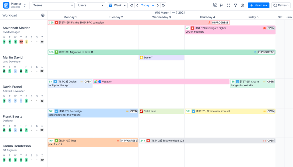
When our team lead sees red under a name, the fix is the same motion: drag a task to someone with room, or stretch it across more days. No status meeting required.
Two things make this picture honest. First, vacations, sick leaves, holidays and bookings live on the same canvas, so capacity isn’t a theoretical 40 hours but what’s actually left after real life. Second, a caveat we’d rather say out loud: the indicator is only as good as your estimates. If half your issues have no estimate, the timeline will cheerfully tell you everyone is free. Fix the estimates first; the visualization comes for free after that.
“What’s the bigger picture?”
Individual planning works great until leadership asks about next quarter and you don’t yet know who will do the work, only which team should.
For that, the Planner zooms out. Switch from the Users view to Teams, and each row becomes a whole team with its combined capacity. You can drop an epic straight onto a team’s timeline months before it’s broken into tasks: a placeholder for real work, visible in every capacity calculation. The Team with Users view sits in between, with the team’s total at the top and each member underneath, so you can see both the strategy and where it lands.
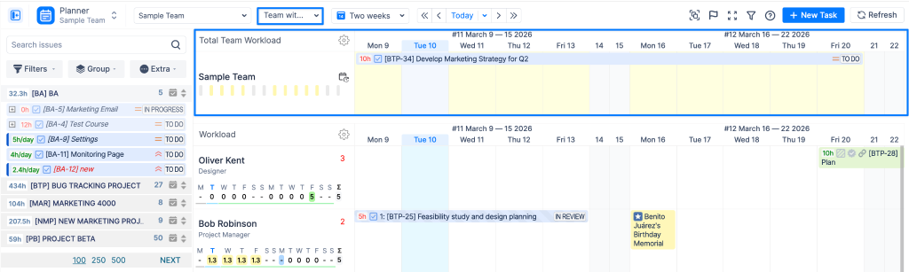
Our example team’s lead uses the weekly Users view every day. Their department head opens the quarter-scope Teams view maybe twice a month. Same data, different altitude, and neither of them maintains a spreadsheet anymore.
“Did the plan survive reality?”
Here’s where it gets a little uncomfortable, in a good way.
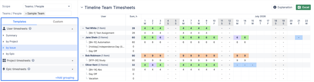
Once the team logs time (in Jira or in ActivityTimeline, both land in the same place), the Timesheets module shows everyone at a glance: hours per person per day, color-coded against their capacity. Too little logged, too much logged, just right. You see it in seconds, and one click on a cell shows exactly what was worked on that day.
And then there’s the Planned vs. Actual chart, which we’ll admit is our favorite mirror. It puts three numbers side by side: what the team’s capacity was, how much of it you planned, and what was actually delivered. When those bars disagree, that’s not a reporting problem. That’s a conversation worth having. Maybe estimates run 30% optimistic. Maybe one project quietly eats time nobody budgeted. The chart doesn’t fix it, but it ends the arguing about whether it’s happening.
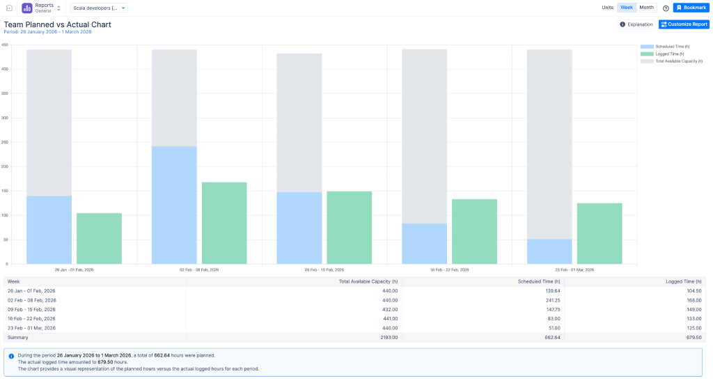
Treat this as a mirror, not a surveillance camera. In our experience, teams that use these views to improve estimates get better fast. Teams that use them to grade individuals get creative timesheets instead.
“And what did it cost us?”
Now the question that, at most companies we know, still lives entirely in Excel.
Jira tracks hours, not money. There are no rates, no budgets, no way to know that the sprint you just finished cost more than the client is paying for it. So somebody exports worklogs each month, applies salary data by hand, adds the contractor invoices from a different file, and delivers a cost picture that’s already three weeks old.
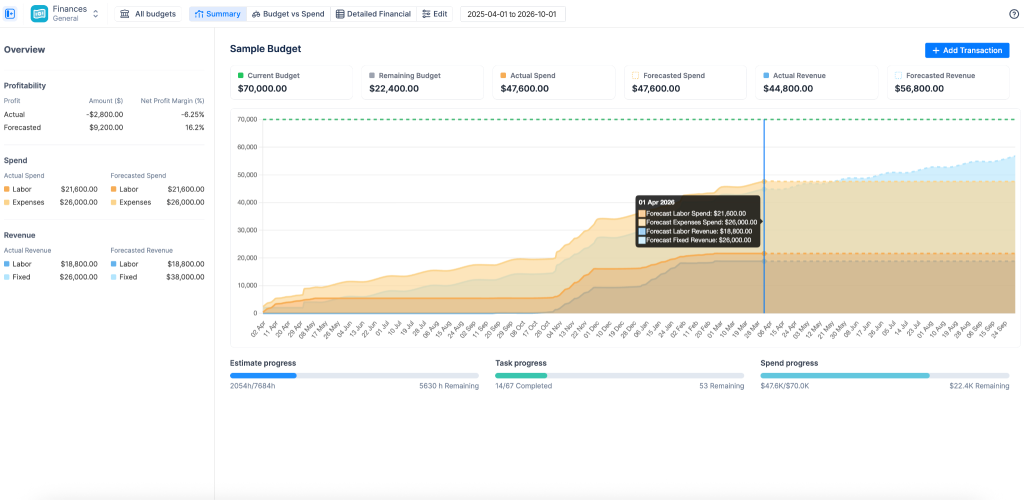
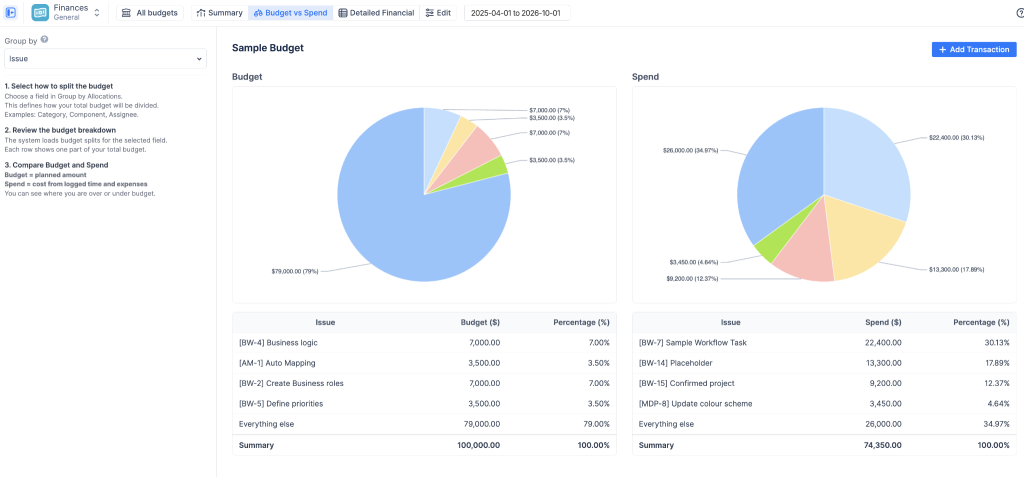
ActivityTimeline’s Finances module puts that layer inside Jira. You set hourly rates (per role or per person, cost and billing separately), and every logged hour becomes money automatically. A budget is a container you point at whatever you’re delivering: a Jira project, a set of epics, or a JQL filter. Set a fixed cap, or let the system calculate the budget from estimates. Costs that never touch a worklog, like licenses, travel, or a contractor’s invoice, go in as manual transactions and sit alongside labor costs, so you’re looking at the whole picture, not just the hours.
The result is a dashboard that answers the question finance actually asks: are we on track, or are we going to run out? Budget burn against progress, planned spend against actual, and a trend line that flags the project likely to blow its budget before it does, not in next month’s spreadsheet.
And rates are sensitive, so access is role-based: managers and finance see budgets, the rest of the team doesn’t stumble into anyone’s hourly rate.
What changed for our team
Back to our team of twelve. Nothing about their Jira changed: same projects, same issues, same worklogs. What changed is that four different people now look at the same data and each sees their own answer. The team lead sees who’s overloaded this week, the department head sees next quarter’s capacity, the delivery manager sees plan versus reality, and finance sees budget burn. Zero exports.
Jira tells you what’s happening. Visualization tells you what it means.
If this sounds like your planning calls, ActivityTimeline has a 30-day trial on the Atlassian Marketplace, so you can see if it fits before paying anything. And if you’d rather have someone who’s done this rollout a few dozen times set it up with you, you’re already in the right place: that’s exactly what the Nimble Evolution team, our hosts on this blog, does.